The label of Katarina Radović — couture with the designer’s own hand all over it. We gave her name a house: a wordmark cut like cloth, paper worth pinning to, and a system that lets the sketchbook walk the runway.
A young couture designer whose garments carry her own drawings needed a label with the poise of a fashion house — without ironing the life out of her hand.
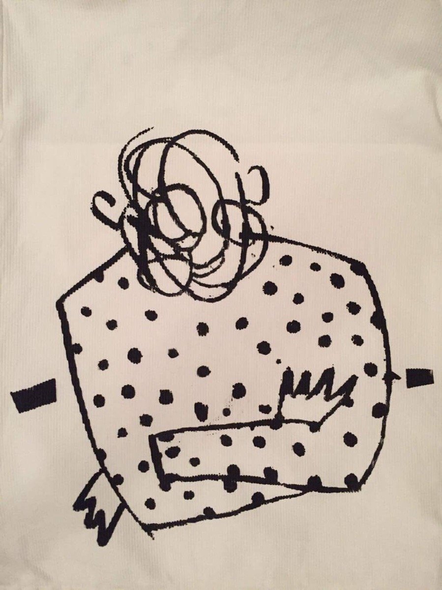
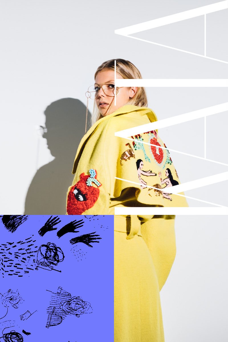
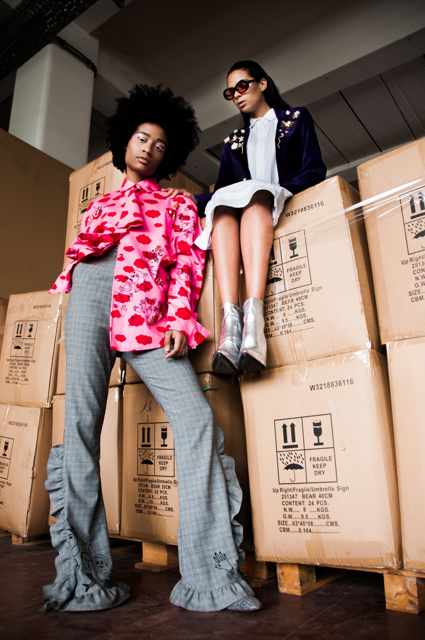
Katarina embroiders her sketches onto coats. She screen-prints her scribbles onto cotton. Her collections read like a diary someone dared to wear. Most identity systems would have sanded that down into something “clean.” The brief we agreed on did the opposite: build the house so polished that the mess inside it reads as intent. Discipline on the outside, riot on the inside — the same tension her clothes run on.
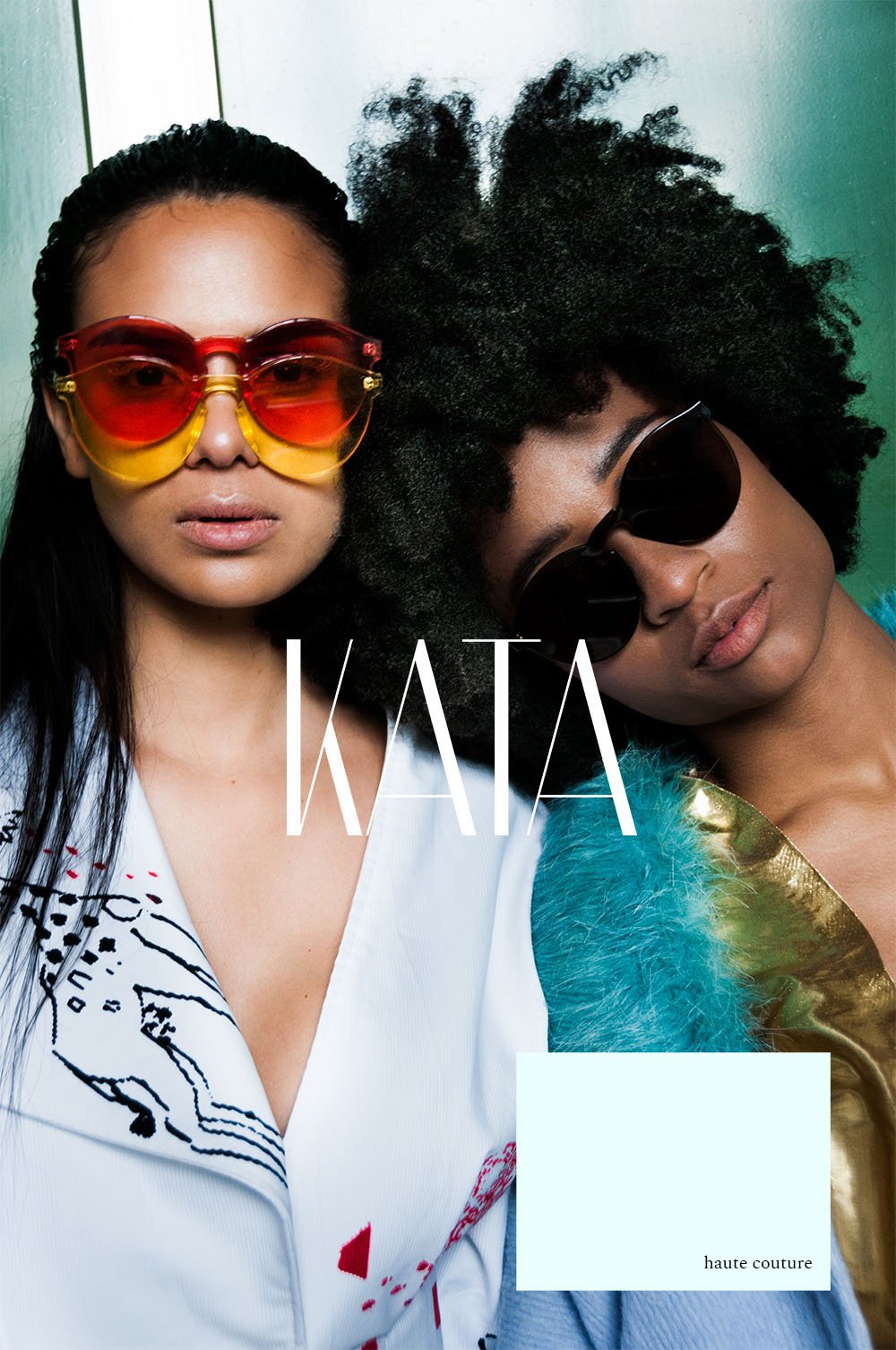
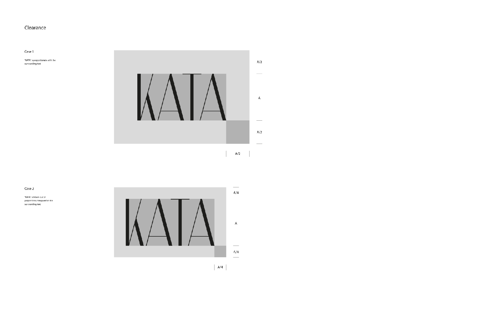
KATA is what everyone calls her. We drew it the way she cuts: needle-thin hairlines against heavy stems, and one leg of the K sliced clean on the diagonal.
The contrast is the couture in it — thread against fabric, pencil against ink. Every stroke is either a hairline or a slab, nothing in between, and the crossbars sit high like a raised hem. The diagonal cut through the K is the scissors: the one gesture in the mark that behaves like her studio sounds. It holds a poster at two meters and an inner label at two centimeters.
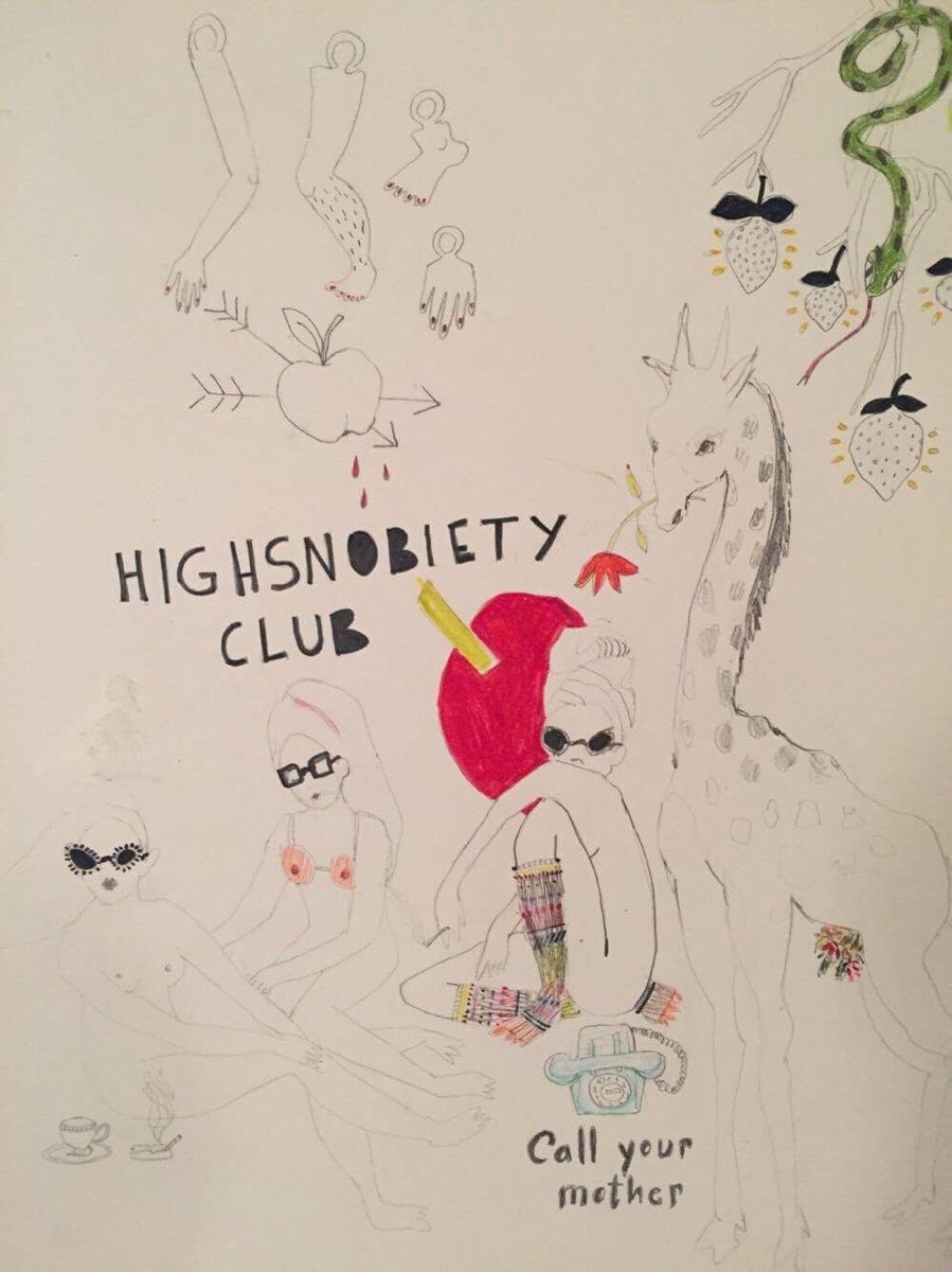
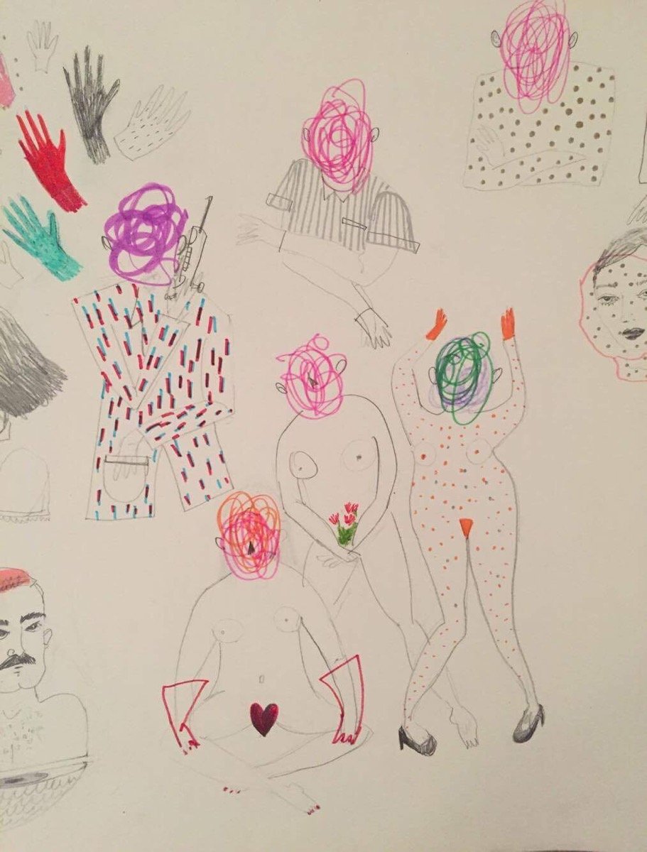
The identity’s second voice is Katarina’s sketchbook — scribble-faced figures, gloves, giraffes, notes to call your mother.
We didn’t redraw a single line. The system simply gives the sketches formal standing: they travel from sketchbook page to silkscreen to embroidered patch with their pulse intact, faces hidden behind scribbles like the models haven’t agreed to be seen yet. The wordmark brings the discipline; the hand brings the blood. Neither survives alone.
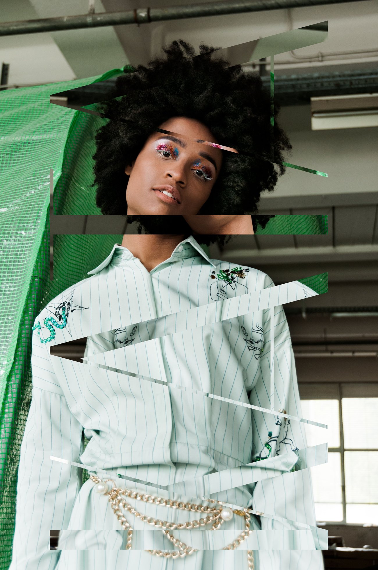
The art direction treats photography the way a pattern-maker treats fabric: slice, shift, re-seam.
Lookbook images are cut into strips and set back a few millimetres out of register — the garment stays whole, the picture doesn’t. Geometry from the wordmark’s diagonal wanders across frames as white thread-lines; swatches of pale paper carry the captions. It photographs couture the way it’s actually made: in pieces, precisely misaligned, then sewn.
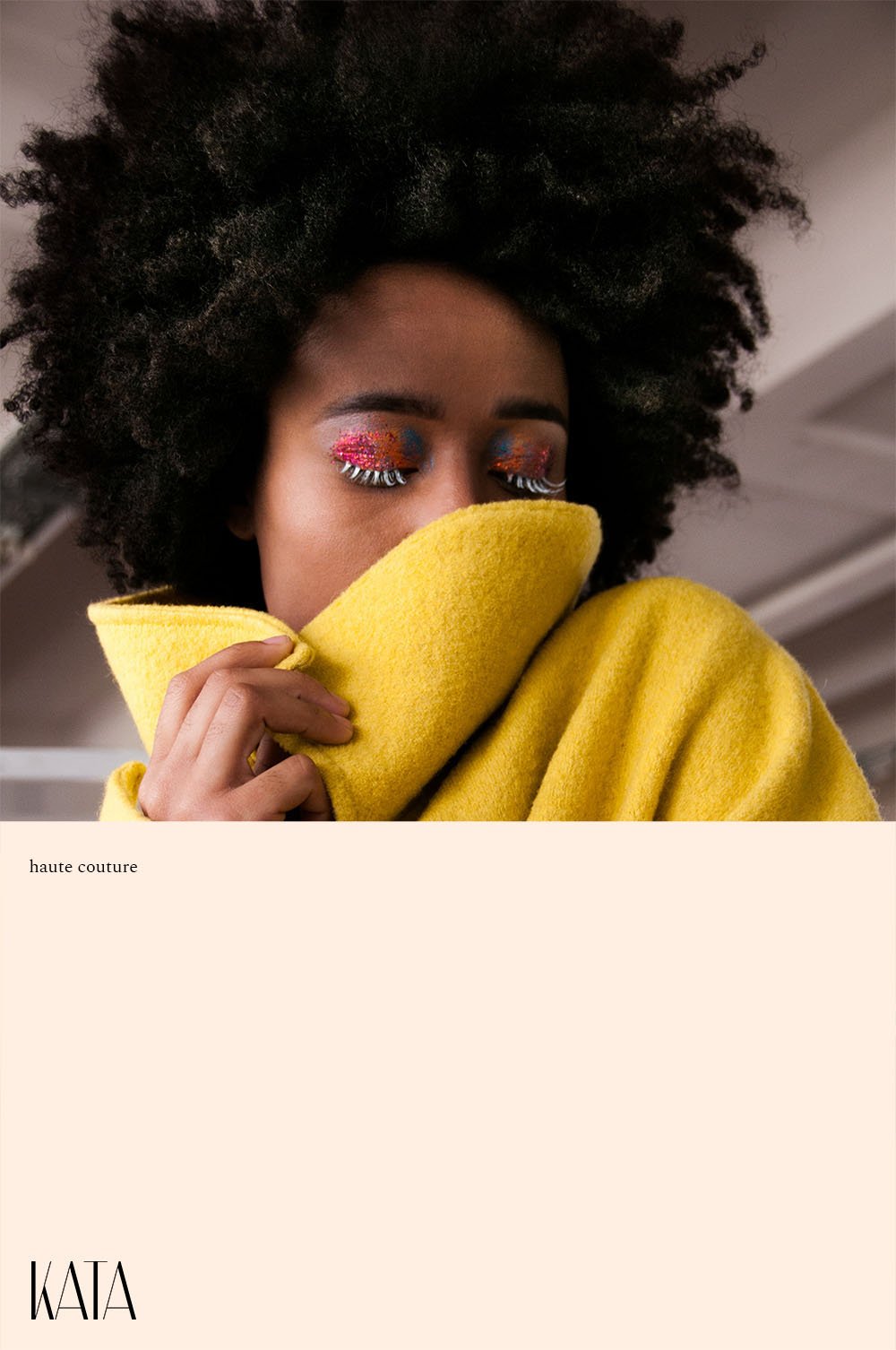
Every season fronts like an issue: photograph, wordmark, and two words in small serif — haute couture — set on a swatch of paper.
The covers are where the whole system meets: the mark holds the center or signs the corner, the pale swatch carries the caption like a garment tag, and the photography does the talking. Nothing shouts. Fashion houses whisper and get leaned into.
Figs. 08–09Issue fronts — the tag sewn onto the photograph
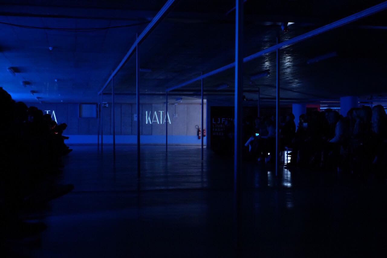
Then the room goes dark, and four letters do what they were drawn for.
At the show, the identity ran the venue: the wordmark projected onto concrete, hairlines surviving at ten meters, the room dressed in the same discipline as the label. No step-and-repeat, no sponsor wall — a name, thin light, and the clothes.
Sewn, not said.
← All success stories