Monolith
Success Stories / 009_ Feed — NMS · 15 min delayed

Nickel & Swan

Options data is the loudest data in finance. Every ticker drags a whole surface behind it — implied volatility by term, open interest, spreads, skew — and most platforms answer by stacking dashboards until the signal drowns. Nickel & Swan asked for the opposite: the entire analytics suite on a single page, readable by a trader who has ninety seconds between meetings.
ClientNickel & Swan
ProductOptions analytics platform
ScopeUX architecture, data visualization, UI design
OutputOne-page app — 11 graphs, icon system, live feeds
Nº 1

The brief

Serious options traders live inside a terminal all day. The brief was never to make options friendly — it was to make eleven dense graphs stop fighting each other on one page.

Nickel & Swan reads the whole options market — volatility, term structure, open interest, spreads — and turns it into trade ideas tuned to the risk a trader is actually willing to carry. These users don’t want a simpler product; they’d resent one. They want a calmer one. So the work was architecture, not decoration: one page, every graph, every legend, every feed, and nothing important hidden behind an onboarding tour.

Traders don’t want fewer numbers. They want the numbers to stop talking over each other.

Nº 2

The module

We designed one card, then refused to design a second one.

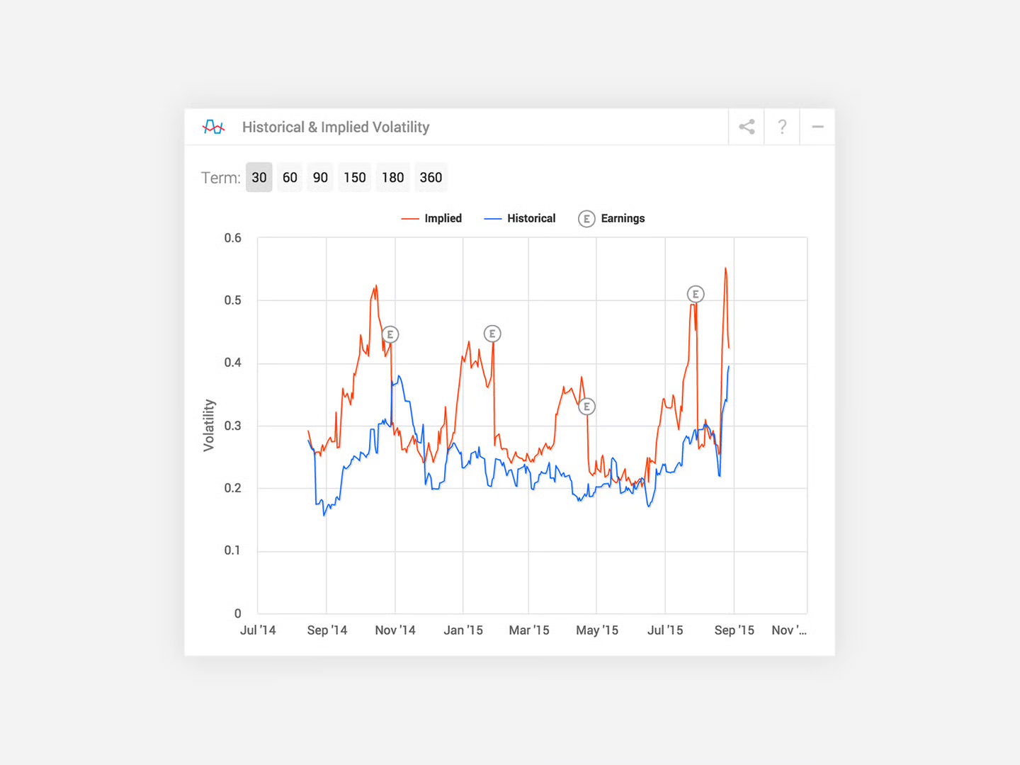
Every graph lives in the same module: pictogram and name in the corner, time horizons as pills, the legend spelled out in words, share and help and collapse in the same three pixels on every card. Learn one module and you’ve learned the platform — the eleventh graph costs a trader nothing. The specimen below is the volatility pair: implied in red, realized in blue, earnings circled where they detonate.

Nickel & Swan's Historical & Implied Volatility module: term pills for 30 to 360 days, a legend reading Implied in red and Historical in blue, and a chart where circled E markers sit on the implied line at each earnings spike
Fig. 01The module — one of eleven; learn it once
Nº 3

Try it

Screenshots can’t show the part that matters: what it feels like to ask a chart a question.

So here’s the volatility module rebuilt small, in our ink. The terms actually switch. The crosshair actually reads. The earnings bands are where the red line loses its temper. The data is synthetic — the interaction pattern is the exhibit.

Historical & Implied Volatility
Term:

Fig. 02Terms switch · crosshair reads · earnings marked — go on, hover it

What the work argues

Noise is just data before design.

// eleven graphs · one grammar · zero onboarding tours

Nº 4

Color is
a contract

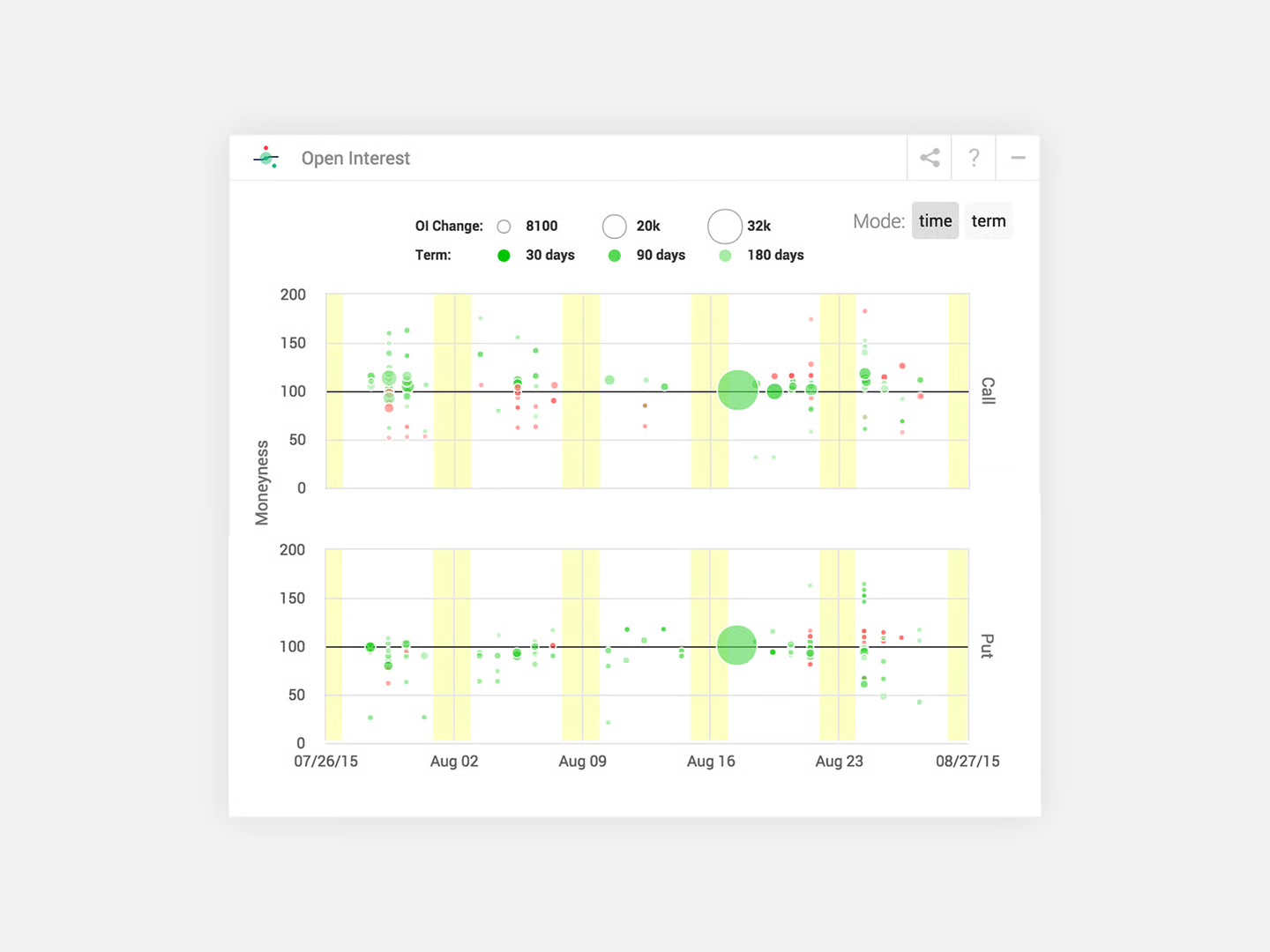
Red always means implied. Blue always means realized. Green only ever means open interest, and a yellow band is an earnings week wherever you meet one.

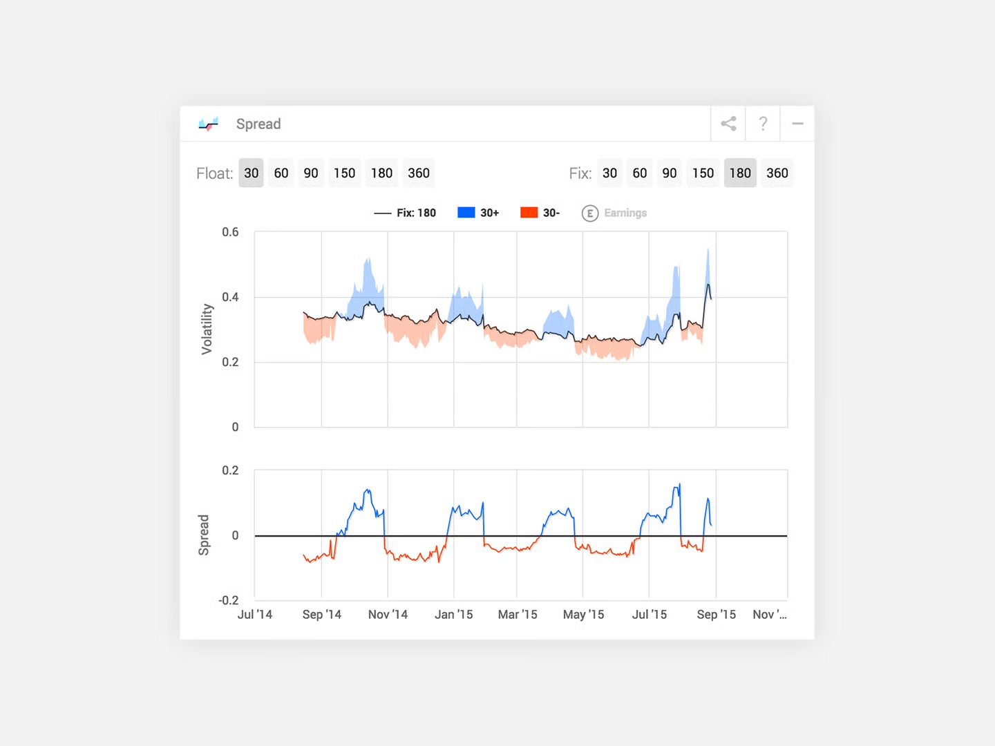
That’s the entire trick. With eleven graphs sharing a page, color can’t be a mood — it has to be a contract, honored on every card. The spread chart and the open-interest map below share almost nothing structurally, yet a trader who learned the colors on the first graph reads both without glancing at a legend. The page stays quiet until you ask it something; the details stay one hover away.

The Spread module: float and fix term pills, a volatility chart where the gap above the fixed line fills blue and the gap below fills red, and a second panel plotting the spread itself around a zero line
Fig. 03Spread — blue above the fix, red below, same words as everywhere
The Open Interest module: call and put panels plotting moneyness over a month, bubbles sized by open-interest change and shaded green by term, with yellow bands marking expiry weeks
Fig. 04Open interest — a different shape, the same contract
Nº 5

A pictogram
per graph

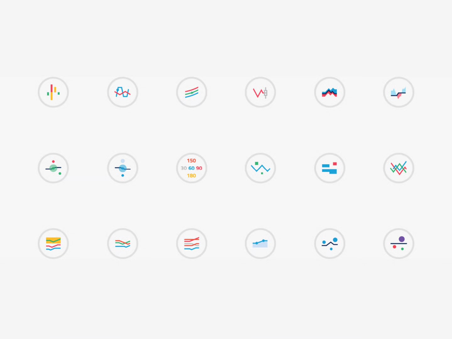
Every module earns a mark: the graph it opens, reduced to a drawing the size of a coat button.

The icon system is the platform’s index. Each glyph is its own chart in miniature — the volatility pair, the spread’s twin lobes, the open-interest bubbles — drawn in the same colors the real module uses, so the menu teaches the encoding before the first chart even loads. Eighteen drawn, eleven shipped; the spares are waiting on the roadmap.

Eighteen circular chart pictograms on a light field — each one a miniature of the graph it opens, drawn in the platform's red, blue, green and yellow encodings
Fig. 05The index — each icon is the chart it opens
Nº 6

One page,
whole market

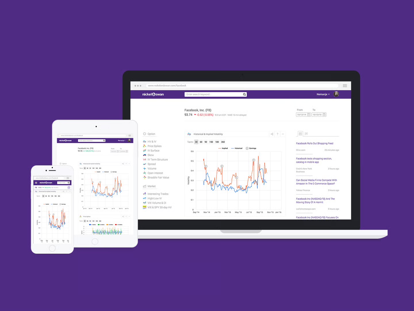
Everything else stayed on the page too — search, watchlist, a news feed that reads along with whichever ticker you’re on.

The left rail is the index of graphs. The right rail is the market talking. The middle is whichever question you’re asking right now. And it all holds up on a phone, because “check the spread from the parking lot” turned out to be the most honest use case in the whole research pile.

The Nickel & Swan platform across laptop, tablet and phone: purple chrome, a left rail listing all graph modules, the Facebook volatility page in the middle, and a live news feed running down the right
Fig. 06Laptop to phone — the rail, the feed, and the question in the middle

Volatility is the product.
It shouldn’t be the interface.

← All success stories