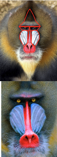
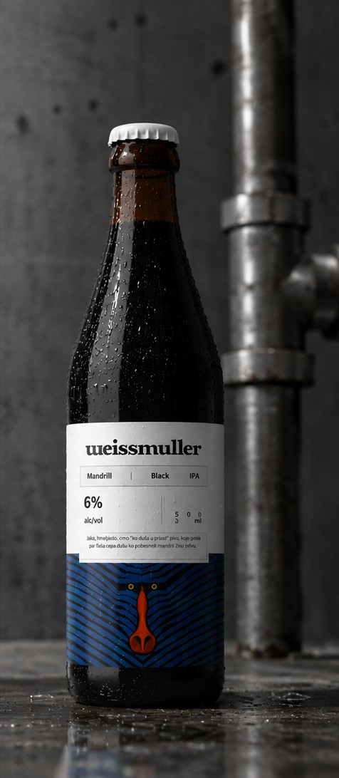
Weissmuller doesn’t make polite beer, so we weren’t about to give them a polite label. We didn’t invent a mascot for this one — we found it already living on the animal the beer is named after, wearing almost exactly the pattern we’d have drawn ourselves.
Weissmuller actually does what most craft breweries only claim to — small batches, one flagship beer, nothing seasonal to hide behind. It has to earn its spot on the shelf every single time, no rotating excuses.
The Black IPA already had its name by the time it reached us: Mandrill, because someone on the brew team said the first sip felt like getting punched by something wild and weirdly well-dressed. The brief was one sentence, and it turned out to be enough:
“Make the label as feral as the beer.”
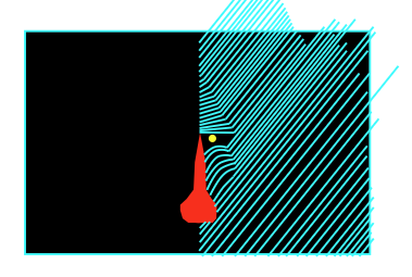
We didn’t invent this mark, we found it on the animal’s face. Earning the right to paint it took six small drawings and one attempt we had to throw out.
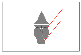
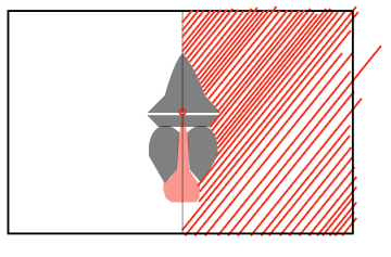
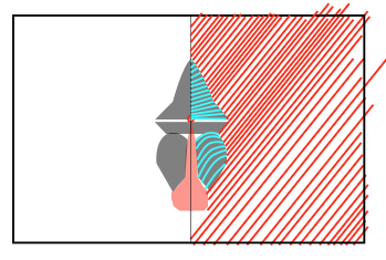
First time we painted it by hand, one stripe didn’t land — you can see exactly where in PL.01, circled in red. So we went back to the actual animal, then rebuilt the pattern properly: reduce it to the shape that matters, write the rules for how the stripes are allowed to grow, and test the line in vector before trusting it in paint again. The plates below are shown at the size we actually worked at, postcard-sized — nothing here was meant to be blown up this big until now.
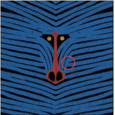
Fig. 01–06Six plates, shown at the size we actually drew them
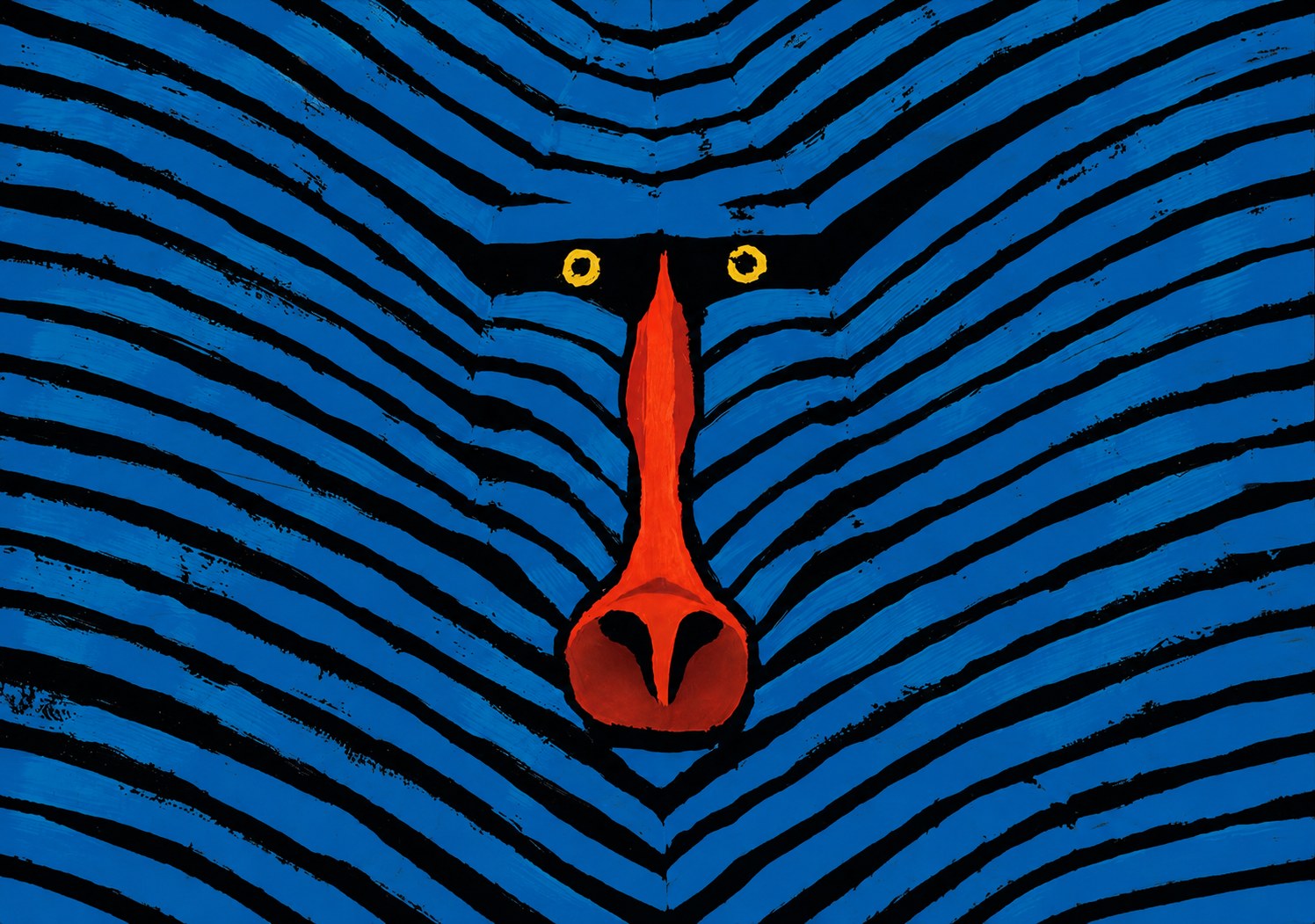
Cobalt and near-black, a nose like a struck match, eyes ringed in gold. Keep scrolling — the sheet takes its ink.
Every stripe here made it through the construction grid, the line test, and a last correction pass before it went anywhere near a bottle. It has to read from across a bar and it has to read printed the size of a stamp on a cap — most “wild” branding never gets checked at that second size, and it shows.
Fig. 07The finished mark — painted by hand, revealed by scroll
Strong. Hoppy. Black as a guilty conscience — the kind that tears through you the way its namesake tears through a zebra.
// the brewery’s own copy, printed in Serbian on every bottle — see Fig. 08
The wordmark is the one polite thing on the label — a warm, lowercase slab serif sitting above all that ink like a brass nameplate on a door.
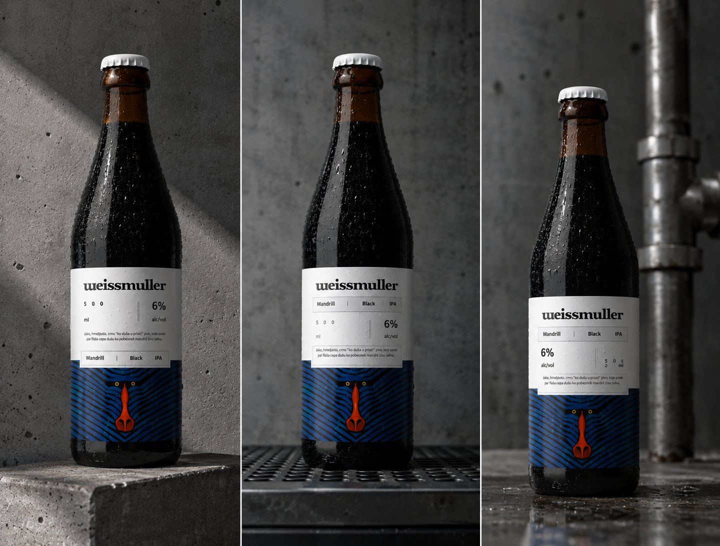
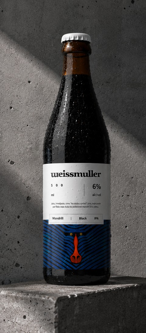
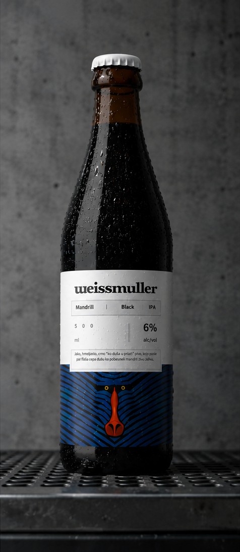
Below that it reads more like a spec sheet than a label — category, volume, ABV, a boxed paragraph that might as well be a warning. The mark itself only shows up as a cropped strip at the bottom: eyes and nose, just enough to recognize from across a bar, cut off before it starts competing with the type above it.
Fig. 08Production bottles — concrete and steel, not a studio softbox
Some labels whisper.
This one doesn’t blink.