A new name, brand, and voice for the systems integrator wiring the Gulf’s most iconic buildings.
Fourteen years of flagship projects across the Gulf — and an identity that told none of it.
Ziotech is a systems integration company operating across the Middle East, India, and Africa, with delivery credits on some of the region’s most prestigious projects — for clients including EMAAR Properties, developer of the Burj Khalifa, Etihad, and Emirates. The work was world-class; the visual identity and digital presence were not. Engaged to design a new identity, we made the case for going further — a full rebrand spanning naming, brand strategy, and copywriting.
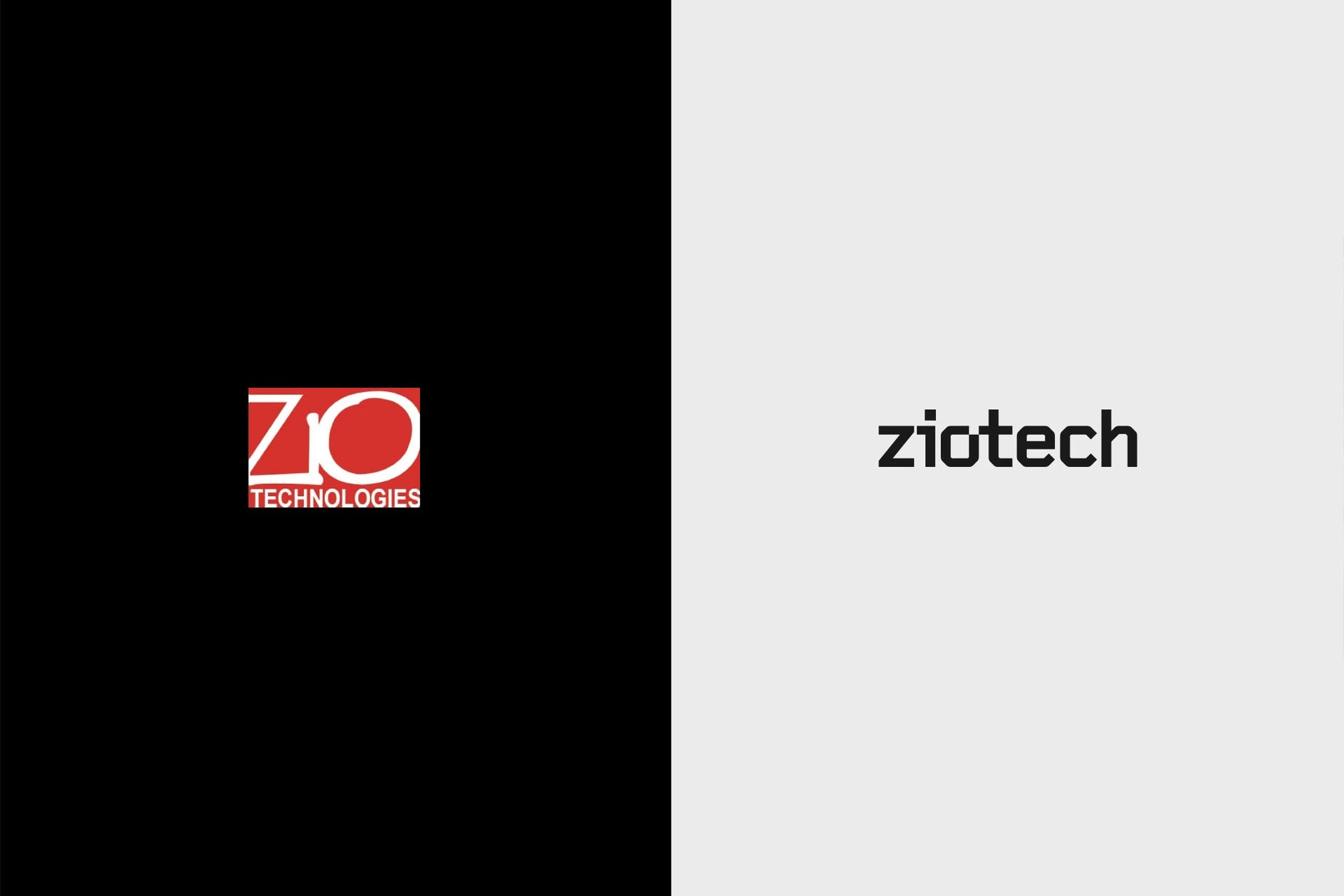
Two words became one: Zio Technologies, shortened to Ziotech.
The wordmark performs the merger — a single engineered form, drawn with the precision of the systems the company installs. The identity keeps the red inherited from the previous logo, but sets it against black and shades of grey, trading a dated mark for a far stronger visual impact.

If electricity is the lifeblood of the built environment, Ziotech’s systems are its nervous system.
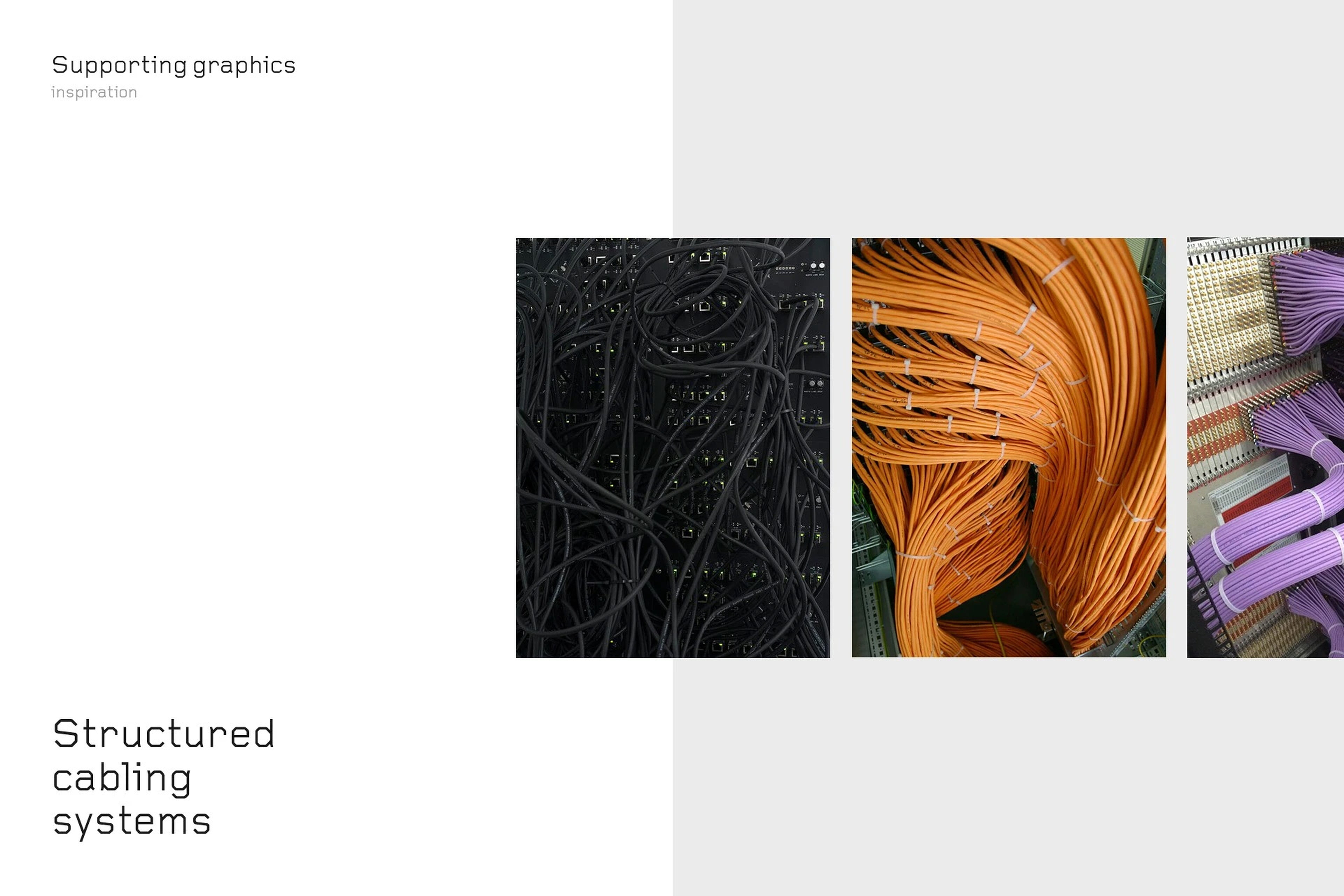
Ziotech’s solutions give buildings senses — ways to perceive and interact with the people inside them. The supporting graphics draw on that analogy: a motif of neuron-like structured cabling, the complex, ordered systems behind everything the company delivers.
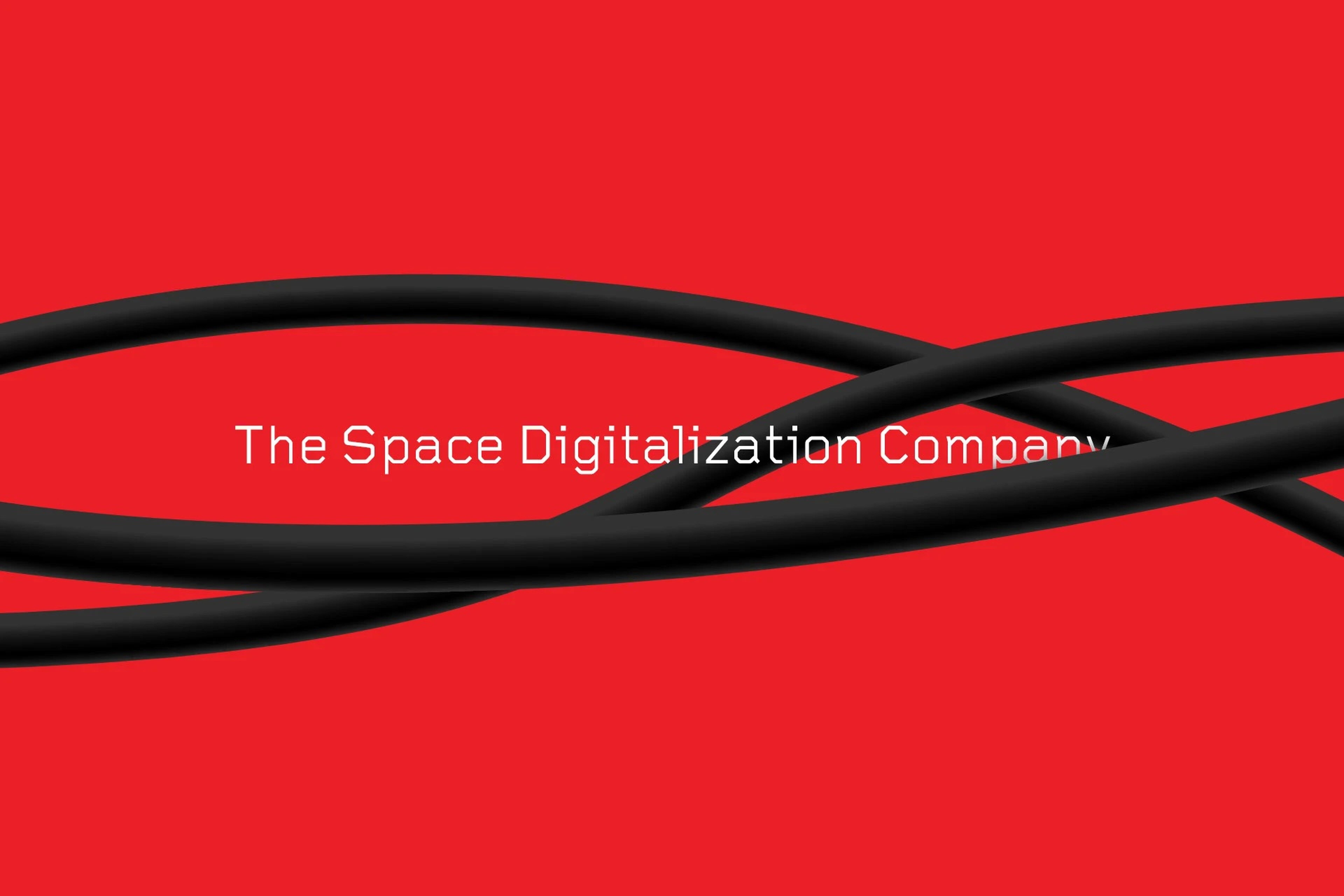
From “The complete solution company” to “The Space Digitalization Company.”
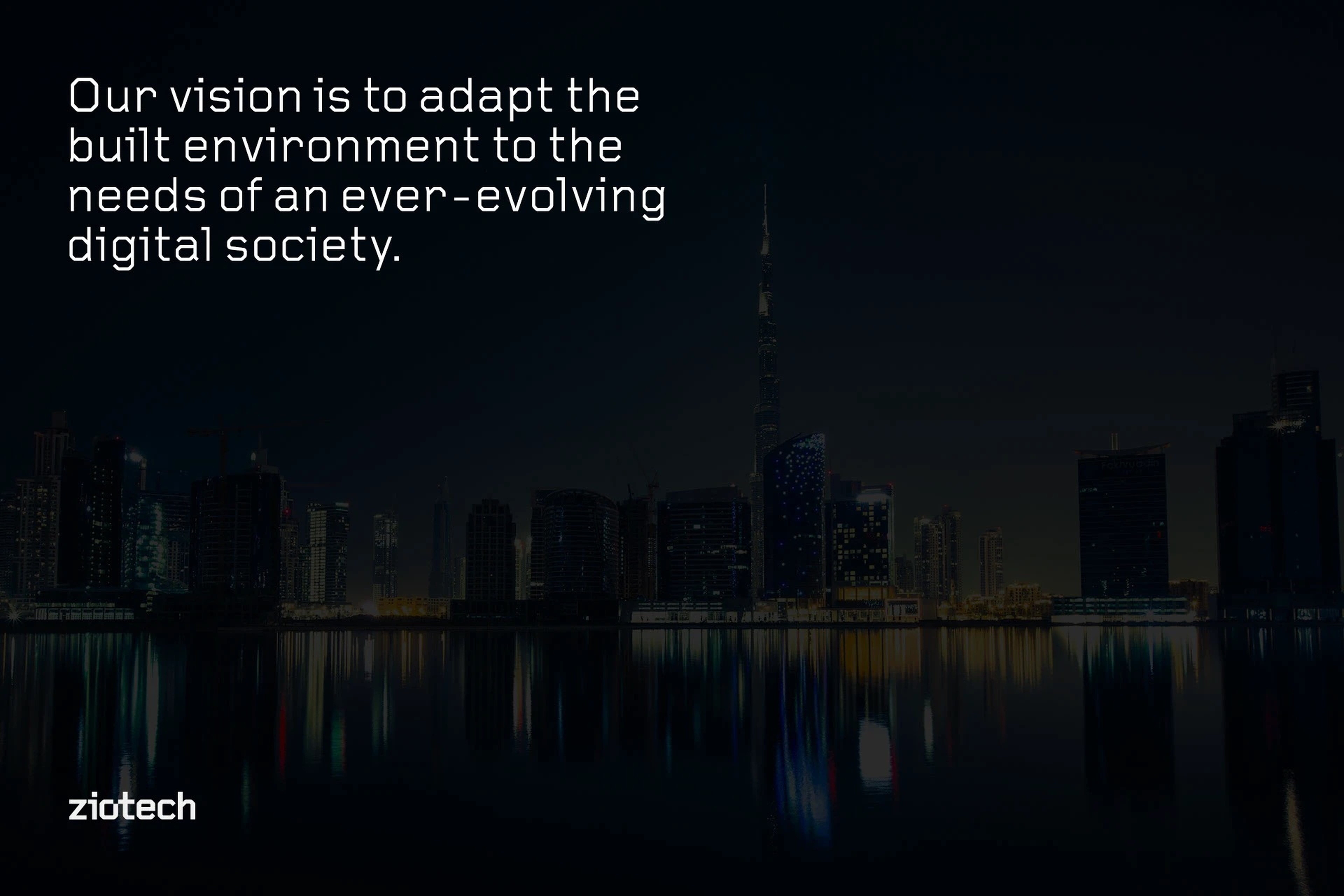
The old tagline could have belonged to anyone; the new one says exactly what Ziotech does. To anchor it, we formulated the company’s vision statement: to adapt the built environment to the needs of an ever-evolving digital society.
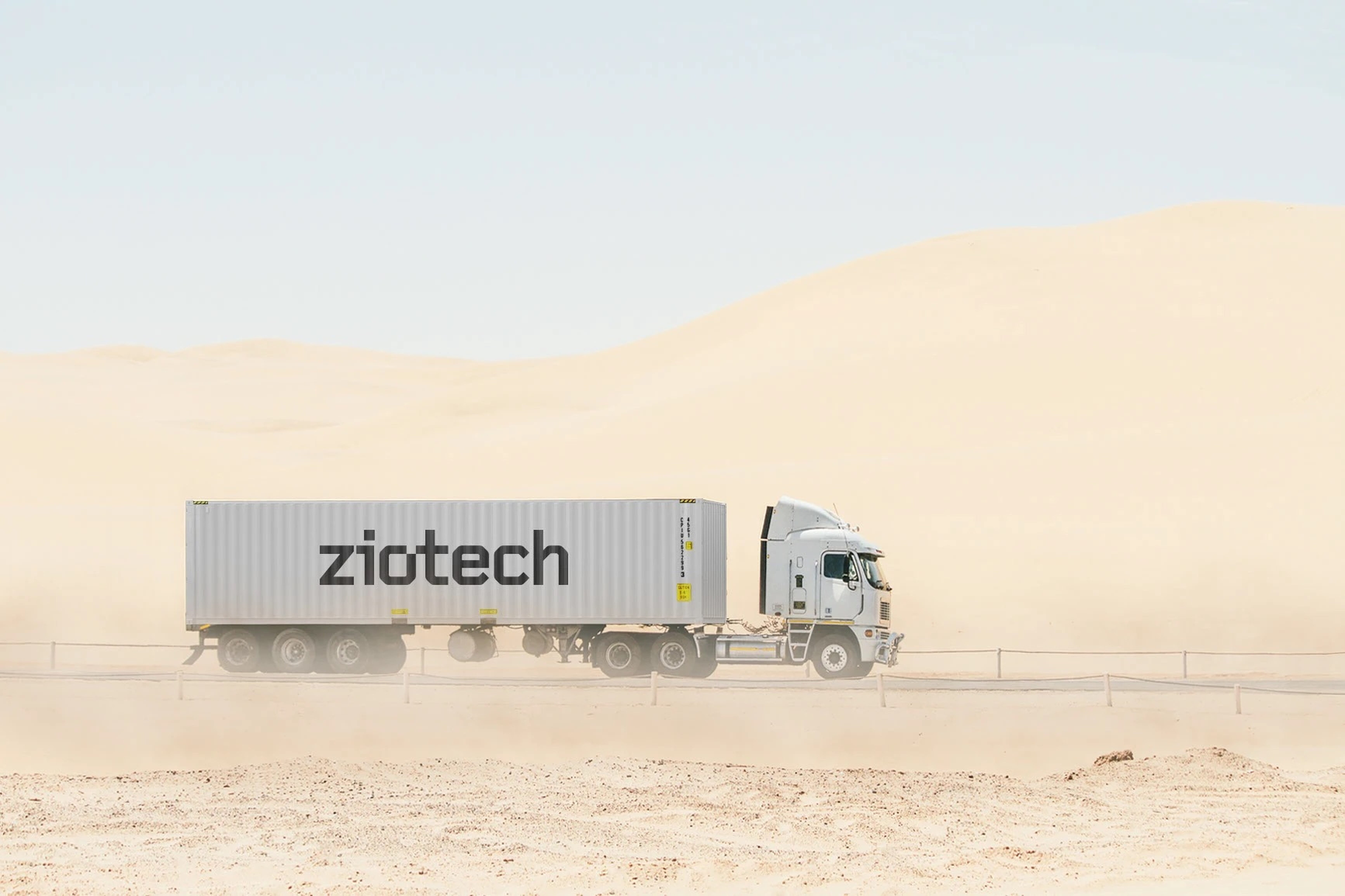
A brand built to survive the field — from freight containers to product cartons.
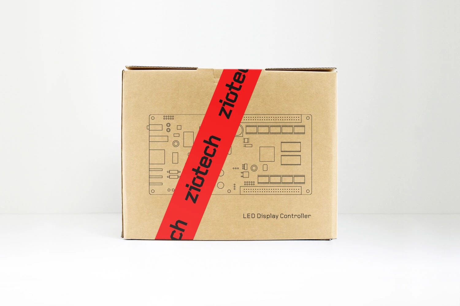
The system extends from the boardroom to the loading dock: fleet livery, technical-drawing packaging sealed with Ziotech-red tape, and every touchpoint in between.